
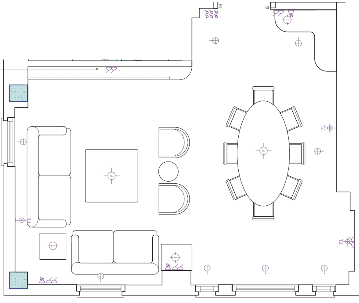
Living room layout - positioning of furniture and electrics within the space, considering ergonomics
Planning a good room starts long before anyone mentions colours or fabric!
It starts with the floorplan and a few nosy questions about how you actually live. Family suppers at the kitchen island, or formal dinners in the dining room? A sofa for reading, or for nodding off in front of the television?
The answers decide where you walk, how much breathing space each piece needs, and where the sockets go (ideally not behind the bookcase). A few centimetres on paper can be the difference between a room that flows and one you shuffle through sideways.
Then come the walls. Wall lights, curtain heights, pictures and mirrors all quietly change how tall and wide a room feels. For example hang the curtains nearer the cornice and the ceiling seems to rise as if by magic, particularly important in rooms with low ceilings.
Joinery is where proportion really earns its keep. Cupboards, shelving or a built-in dressing table must swallow everything you own while still looking effortless. Decisions around style, whether contemporary or classic for example, defining practical heights for shelving, managing scale along the height of the wall, and levelling with other features and furniture in the room all need to be taken into consideration.
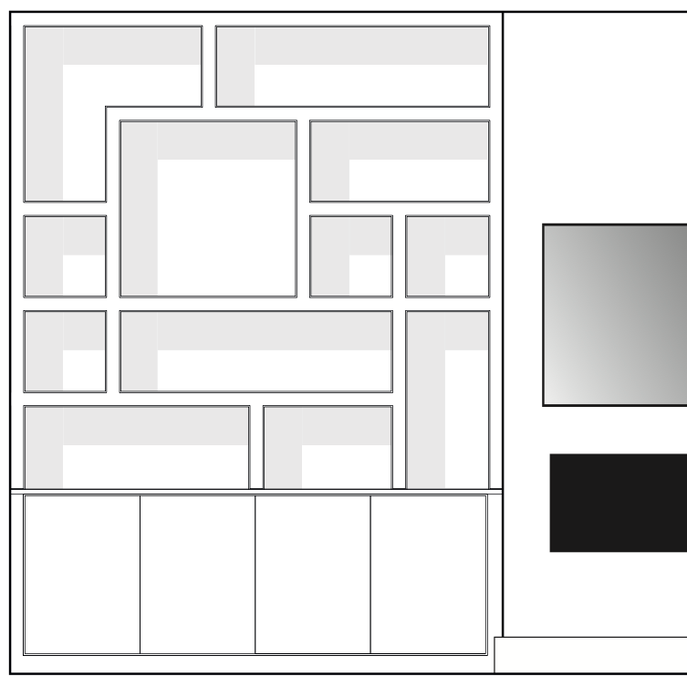
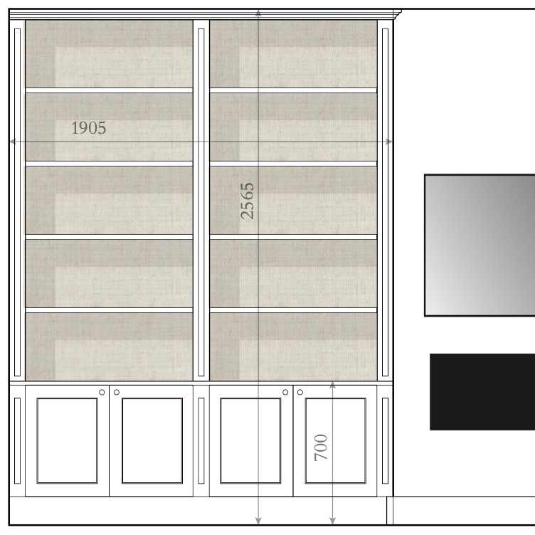
Alternative ‘contemporary’ or ‘classic’ bookcase design within the same space.
Then we consider the furniture, a sofa and ottoman should be on speaking terms: close enough to reach, and at heights that suit each other. Piping, skirts, legs and braids need a considered touch, because without they can look bland, one flourish is chic and four is pantomime.
A generous rug pulls a seating group together and can anchor the space, while a small one can look as though it has been sent to the naughty step. Lamps need shades that fit, and cushions should look plump and plentiful, rather than as if a cushion shop has exploded.
Put it all together and you get something greater than the sum of its parts: a room that simply feels right, even if no one can quite say why. Choosing fabrics and colours that go together is the fun bit. Getting everything in proportion is the bit that turns a pretty scheme into a home.
Can you spot the 7 differences between these two photos?
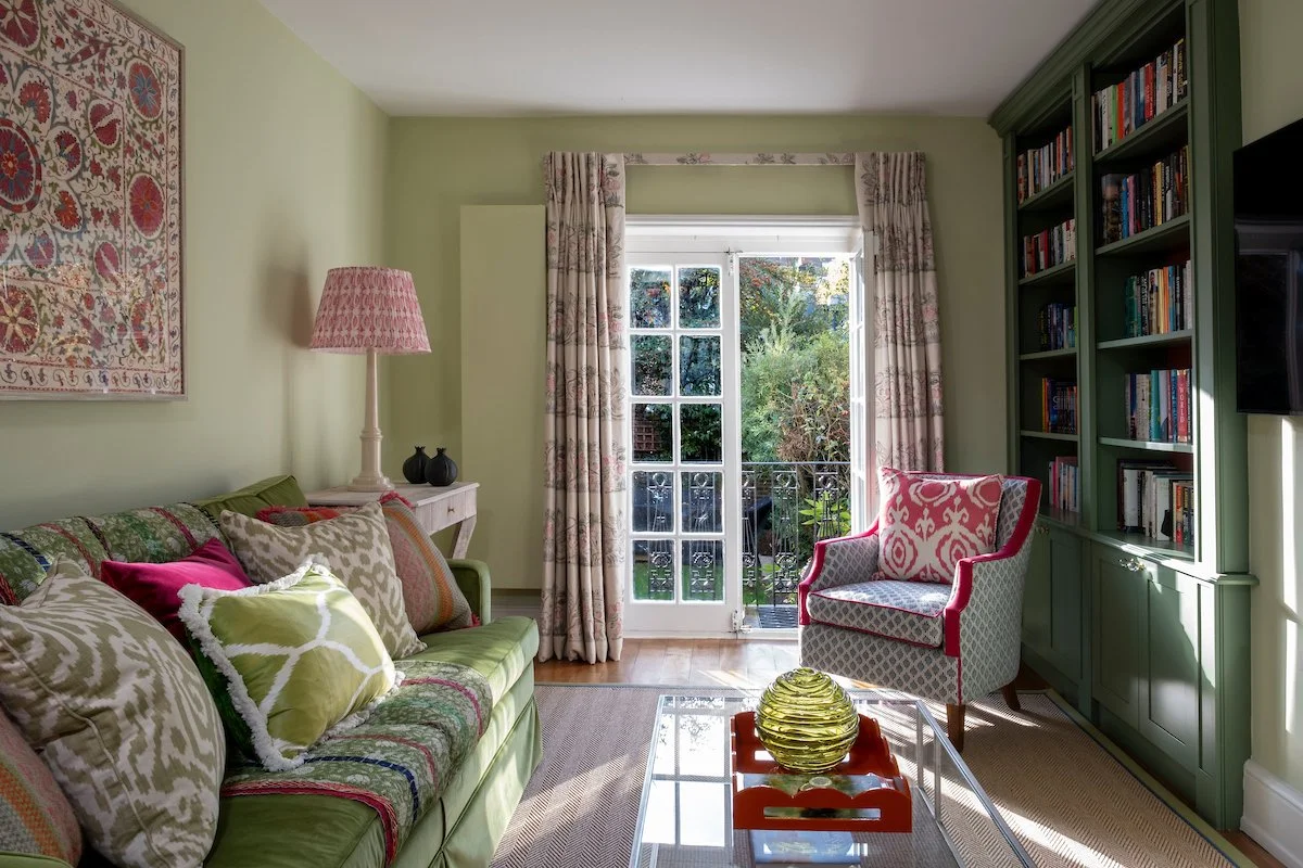
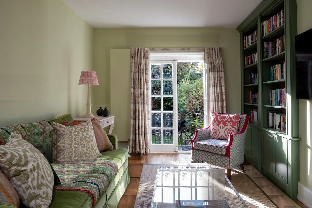
Proportion and styling is an art and can make a real difference - and if you feel we could help you with your project, do get in touch - info@kellingdesigns.com
+44 203 866 4430
Note: Yes, as part of the development process we have played with AI and in so doing crudely adapted the second image.
Answers: 1. Curtain lowered, 2. curtain shortened, 3. shade reduced, 4. tray and vase taken out, 5. rug reduced, 6. no wall art, 7. no red cushion - did you get them all?